Welcome to OU Campus 11
The following is an overview of many of the functional differences users will encounter while working with this new edition of OU Campus.
A video overview is presented first below. You can also proceed directly to a text-and-screenshot presentation of the same material if preferred.
A downloadable PowerPoint presentation of this information is also available.
Video Overview
Text-and-Screenshot Overview
Introduction
OU Campus 11 is a substantial update over the previous version. On first glance it looks very different than the previous version. Don’t let this freak you out, though. In this guide we will cover some of the major changes that will impact you and how you use OU Campus in the immediate future.
New Look and Feel

On first look, OU Campus is now a lot cleaner and easier to read. A major goal of the update was implementing better cross-platform usage between desktop, laptop, and tablet displays.
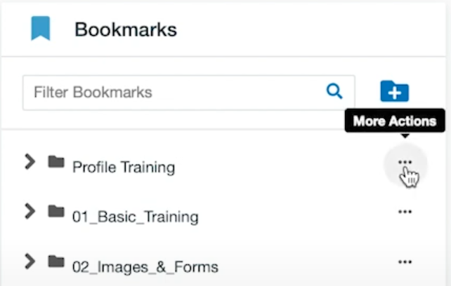
The More Actions Icon
Before we move on, we’d like to mention one thing you will be seeing a lot with OU Campus 11 – namely, the More Actions icon. The More Actions icon is represented by a three dot symbol throughout OU Campus.
When we click on the More Actions icon, the three dots will switch to a vertical pattern instead of horizontal, and a menu of additional options will open.
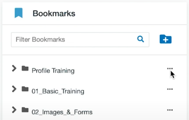
To close the menu, we simply click the More Actions icon again. The menu will close and the icon will switch back to its usual horizontal orientation.
Improved Accessibility
OU Campus 11 has also been updated for increased accessibility and keyboard navigation. If you prefer keyboard navigation, you will find OU Campus 11 an improvement over the previous version.
Now, let’s move on and look at some of the big changes you’ll be seeing and working with.
Dashboard
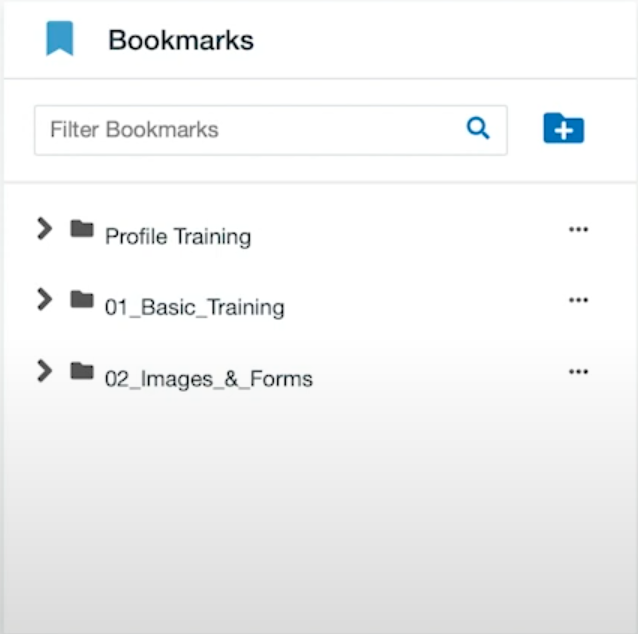
The dashboard has been redesigned with a new layout. Let’s start with the Recently Visited box.
The Recently Visited box provides links to pages you’ve been working on in OU Campus in chronological order. You can continue back through this list by clicking the right arrow icon at the right side of the box.

Below it is the Bookmarks box. This allows you to create quick links to files you work on frequently.
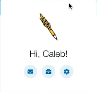
Next up, let’s look at the Icon box.
In this case, Caleb is using a pencil icon as his profile picture. There’s a welcome message from OU Campus, and then three quick access buttons underneath. From left to right, the three buttons are:
- Inbox
- Workflow
- Configure Dashboard Gadgets
The Configure Dashboard Gadgets button allows you to select which gadgets you want onscreen. When clicked it brings up a popup screen where you can select the gadgets you want visible. To select or deselect a gadget, click the circle icon at the upper right of each option. If selected, the circle will be blue with a white checkmark in it. If unselected, the circle will be empty (white) inside.
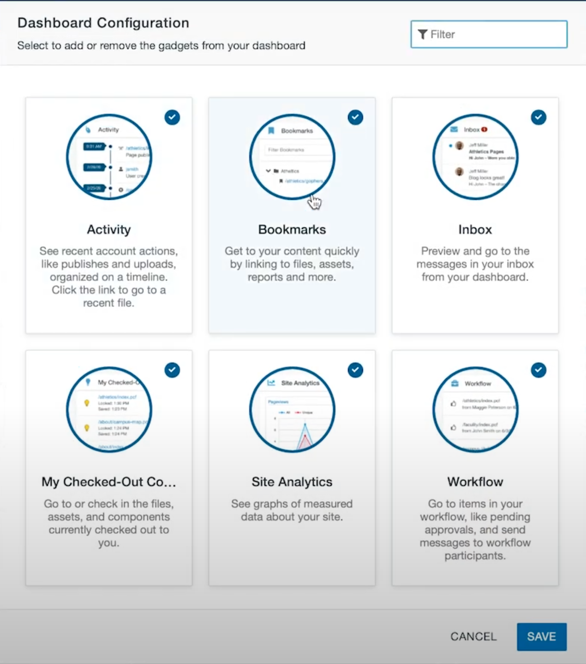
Once you’ve made your changes, click the Save button in the bottom right corner.
The Global Navigation Menu – the menu toward the top left of the screen – has also changed.

To open each menu in the previous version, users hovered over the individual buttons. Now it requires a click to open the menu. If there’s an available submenu there will be a right-facing arrow on the right side of an option. Simply click on the option to bring up the submenu.
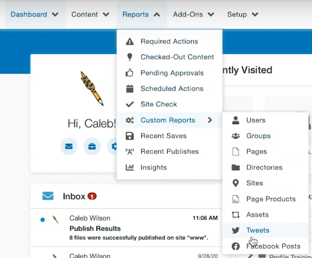
Now, select Content, then Pages underneath it, and we’ll take a look at Page View.
Page View
On first glance, Page View looks very similar as before.
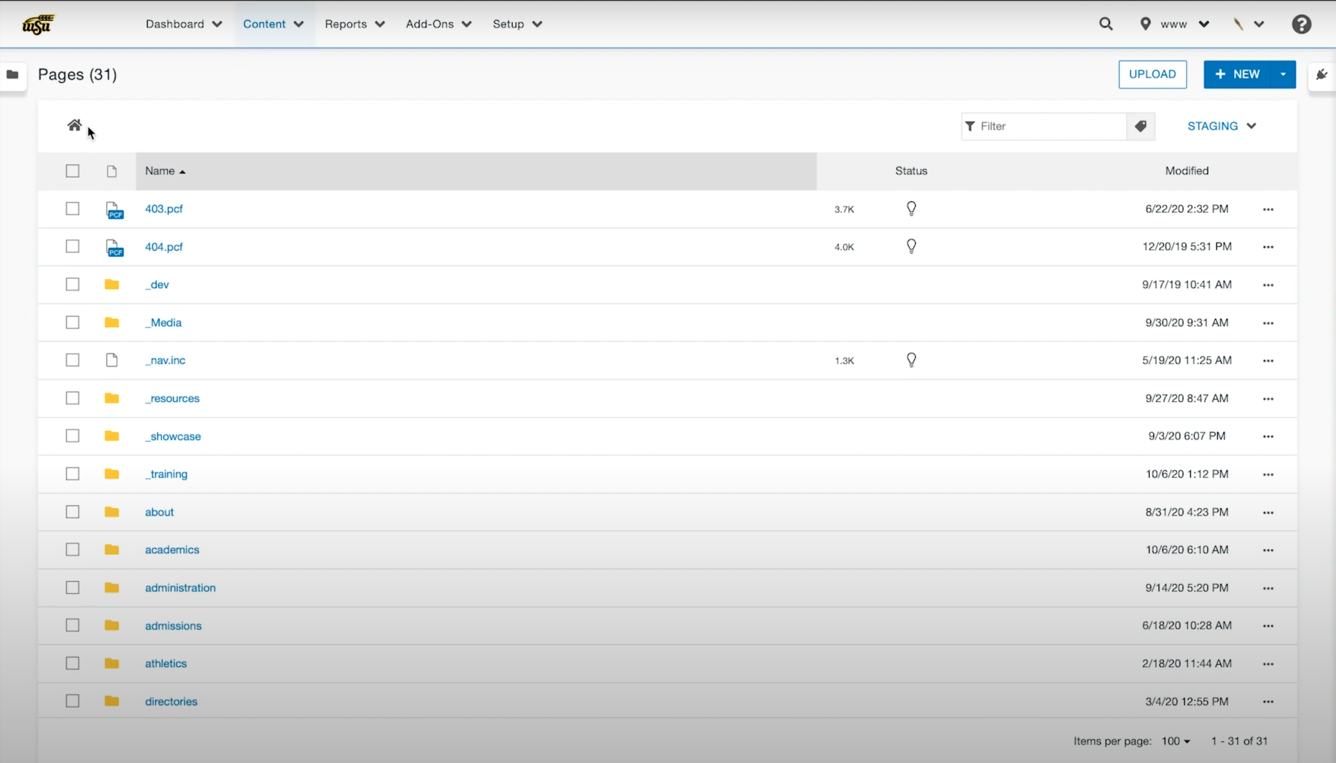
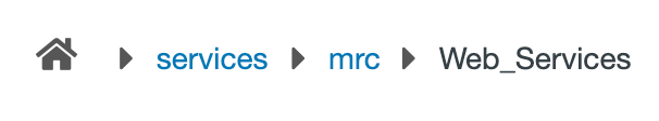
The house icon at the top left of the page indicates that we are at the root of the WSU website directory – we’re “Home.”
As we visit various directories and pages during the course of our work, this will change to reflect the directory path to the area we’re in or working on.
In the previous version of OU Campus, each file line contained a number of options which are now absent. To access the options menu it is necessary to use the More Actions icon (the three horizontal dot icon) on the far right of each file line.
As was covered in the introduction, by clicking the More Actions icon, the icon will change to a vertical arrangement of the three dots and the menu options will open. The options that will be available to you will be determined by your user level.
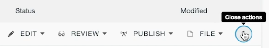
As before, clicking the More Actions icon again will close the menu, and the line of dots will return to its horizontal configuration.
Now, let’s take a look in a sample training directory.
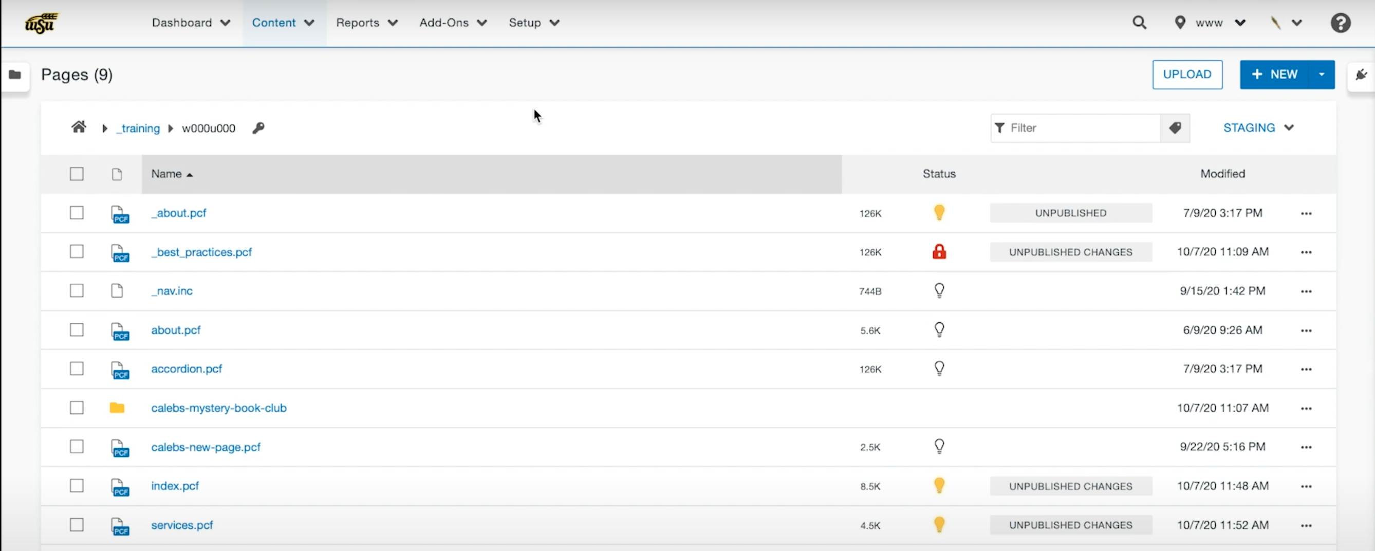
Since the menu items are no longer always present, OU Campus can now present us with useful additional information.
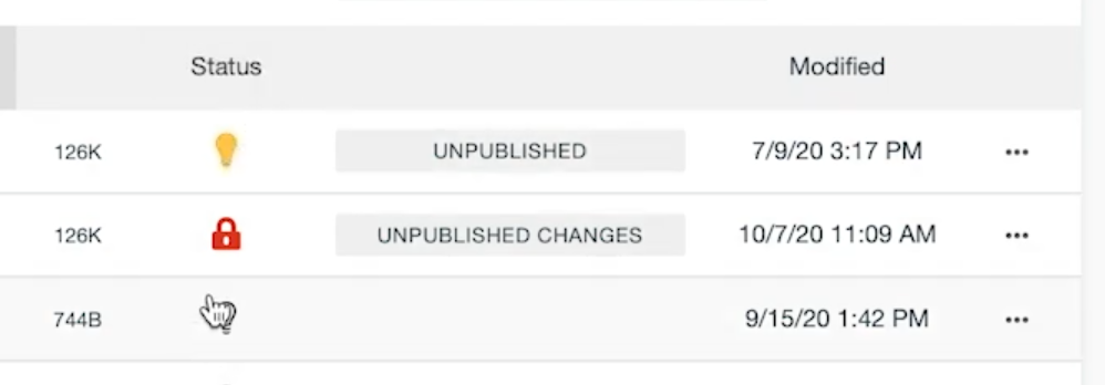
First up, the Page Status. A yellow light bulb means you have the page checked out, a red padlock means someone else has a page checked out, and a white light bulb means the page currently isn’t checked out by anyone. If you encounter the red padlock on a page you need to work on, hovering over it for a moment will bring up a popup showing who currently has the page checked out.
Between the Status column and the modified date column each page’s publication status is shown. Unpublished means the page exists, but hasn’t been published and isn’t “live” on the website yet. Unpublished Changes means that the page is live, but there’s been work done on the page that, while having been saved, haven’t been published yet. If the field is empty it means that the page is published and up-to-date with the most recent changes.
The Publish Page box that pops up whenever the “Publish” option is used also has a different look.
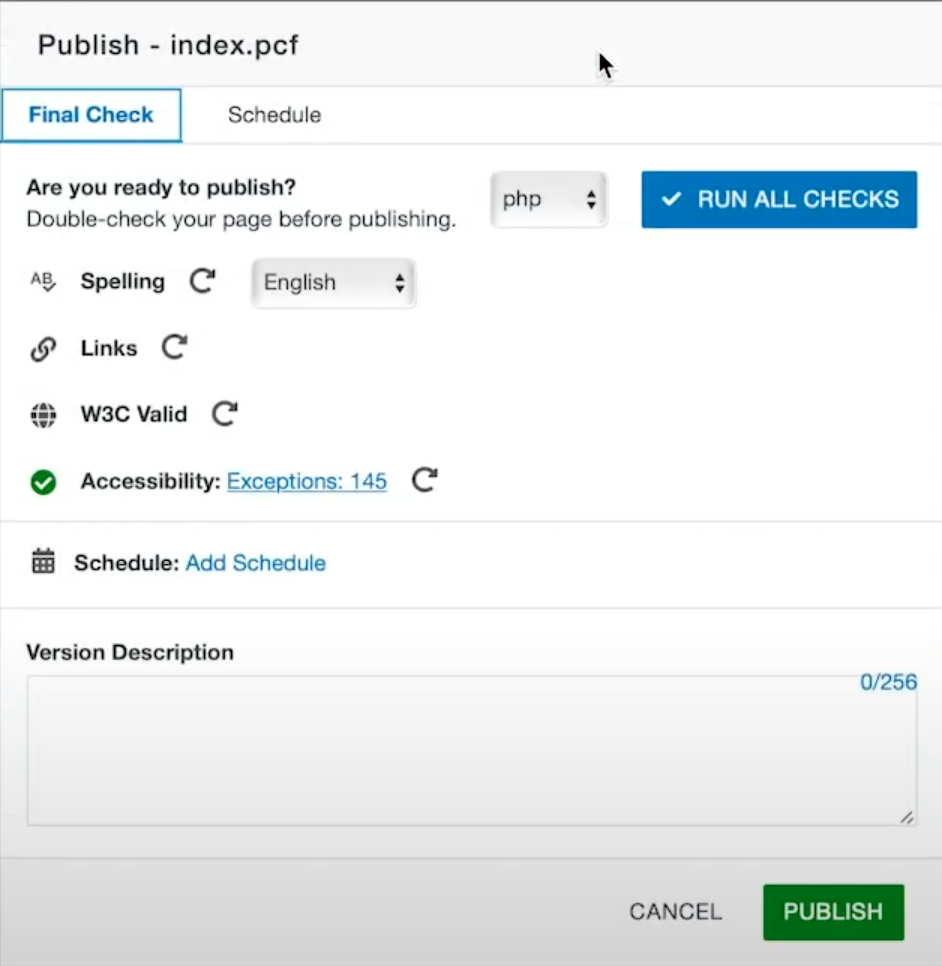
Note that the options are the same, but are presented vertically instead of horizontally now. To get a report on each of the topics, click the clockwise circular arrow icon.

In this case, to look at a report of the accessibility exceptions, simply clicking the “Exceptions: 145” link would bring up the information.

After we’re done with this, we can publish by clicking the green “Publish” button in the lower right corner of the Publish Page box.

Whenever a page was published in the previous version, the entire bottom of OU Campus would present the status of publication “Publish is in progress,” “File is now published,” etc. While these indicators remain, they’ve been drastically reduced in size, appear as popups at the bottom left of the screen. The popups overlay the OU Campus edit view rather than taking over the bottom of the screen and altering the view as before.

Page Edit View
Page Edit View doesn’t have much in the way of new functionality but, cosmetically, the layout has changed substantially.

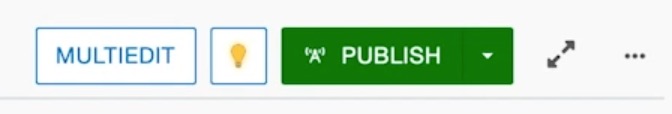
First off, note that the Multiedit button has changed and moved. In the previous version it was a big orange button toward the top center of the edit screen. In the new version it’s moved toward the top right of the screen, a white button with blue outline and text.
Note that we have a More Actions icon to the right of the buttons. If we open that menu we’ll find the Page Check, Save Version, and View Published Page options.

View Published Page allows you to open a tab with the current published version of the page for review and comparison with the version currently being edited.
Another feature added is Toggle Focus Mode.

Toggle Focus Mode removes a portion of the top of the edit screen to maximize the OU Campus editor view, and is intended for use with devices with limited screen size such as tablet users.
Before Toggle Focus Mode:

After Toggle Focus Mode:

WYSIWYG Toolbar
There have been a few changes to the WYSIWYG (What You See is What You Get) toolbar.

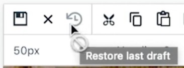
We have Restore Last Draft...
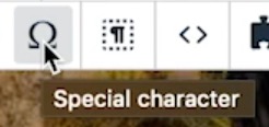
Special Character has become an Omega symbol...
We now have Show Blocks, which supplies a “blocks” view of the content in the area of the page you’re editing.

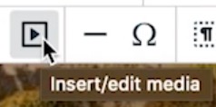
What used to be Insert/Edit Video has become Insert/Edit Media.
Questions?
For questions and other concerns, please reach out to Caleb Wilson at caleb.wilson@wichita.edu.
For OU Campus help, be sure to visit https://learn.wichita.edu/topics/websupport/.