
This webpage presents simple tutorials and best practices for making sure your Microsoft Word documents meet accessibility compliance.
Note: Word documents created for the intention of exporting to a PDF file should always be remediated and optimized for accessibility in Word first. This does not always guarantee a completely accessible PDF document, but it can and often does help minimize the time and remediation work needed to make the PDF fully compliant. Fillable Form documents intended for export to PDF must always have remediation in Acrobat Pro after export in order to apply the form field functionality.
Microsoft Word Accessibility Toolset Tutorial
Checking Color Contrast
Colour Contrast Analyzer Download Webpage
Document Creation: Best Practices
The following best practices are not limited to Word, but include all document types.
Utilizing Headings for Improved Document Accessibility
Do Not Use Footnotes
While the use of indicated footnotes throughout a document can save time on what feels like redundancy in a document's content, they're problematic in terms of accessibility.
- Footnotes are confusing in a non-visual context - while footnotes are clear in their intention and function to readers who can see them, the same is not necessarily true for screenreader users. For example, when the user gets to the end of a line where a footnote symbol, letter, or number indicator is located, rather than telling the user that there is an accompanying footnote, it will say what the symbol, letter, or number is instead. The user may not understand that they're encountering a footnote indicator.
- Footnotes can be difficult to navigate to and from for screenreader users - while those who can see the document can simply scan the document looking for the appropriate symbol to find the information and can scan to find their way back where they started, a screenreader user will have to navigate that content while listening to it to find the corresponding footnote instead. It can make it very difficult for them to find the appropriate footnote, and to find their way back to where they started.
Rather than using footnotes, it's recommended that, if there is additional important information in relation to the original information, incorporate that information into the original line referencing it. In the example provided, rather than having "ENGL 101 College English I*," leading elsewhere to, "*This course requires a grade of C- or better," Simply incorporate all the information on one line such as, "ENGL 101 College English I - Course requires a grade of C- or better." That way all important information is in the same place contextually in the document.
Example of a common footnote type.
Do Not Use Headers or Footers
Headers and footers in Word and PDF documents can be problematic for screenreaders.
- The header or footer may be skipped entirely - This can be particularly problematic if the header or footer presents a document title or some other important piece of information.
- The header or footer becomes a redundant interruption - The screenreader may be reading the content as normal, then, when it reaches the footer or header, interrupt the reading to try to relate the content in that header or footer. Plus, if that header or footer is recurrent throughout the document, it's a redundant element that's going to pop up again and again while that user is trying to listen to the document.

Example of a header in a Word document.
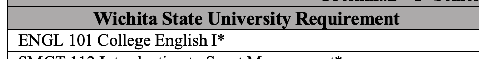
Break Up Complex, Multi-Topic Tables
Tables are often used as much for visual aesthetics as they are for actually presenting information. As such, they can frequently be problematic.
In this table example, we can see that, within a single table, information for a first semester and a second semester are being presented with the subtitle of each section also being presented in table cells. The subtitle cells are presented with bold text in darker cells which, for someone who can see the table, serves as the indicators of the next topical set of information.
- Screenreader users are not able to see the section differentiation - none of the subtitle text is headings in and of themselves, and they are presented in cells as part of the table itself. The user will have to navigate the table until they find where their information is, rather than having an actual heading to reference - for example, a second semester student is going to have to navigate through the first semester student table to find what they're looking for rather than being able to go straight to it.
- Two different semesters of information are presented in one single table - again, this can be laborious for a screenreader user trying to find the information specifically meant for them.
In order to present this information in a far more screenreader friendly application, we can do the following:
- Split each topic into its own table rather than create one single, giant table covering multiple topics
- Make the title of each section a Heading of its own outside and before the applicable table it's referencing
Screenreader users rely on Headings in order to navigate documents. By breaking the subtitle out of the table and making it a Heading, the appropriate section can be found easily. By splitting the table up topically into separate tables and presenting the appropriate table under the new Heading, the user will be able to quickly reach and get the information they're looking for without needing to navigate through a lot of table information that's irrelevant to them.

Example of a table that combines multiple topics into a single whole with titles incorporated within the table. This type of table can be difficult and time-consuming for a screenreader user to navigate to find the information they're looking for.
For improved accessibility the single table has been broken into two tables based around each single organizational topic, and has been given a title heading outside of the table structure so the information can be more easily located in the document.