Why the Change?
- Better use of screen space: The new layout avoids stacked panels that previously reduced content visibility.
- Fewer navigation errors: The “Exit (X)” button was prone to accidental clicks; removing the prominent X to leave a course means users will need to action an exit, rather than accidentally clicking this.
- Improved performance: The work to change from panels to pages aims to give a quicker page load for content as we will no longer be layering panels over the top of each other.
- Clearer context: Simplified URLs and layout help users stay oriented to where they are in the course.
- Reduced motion issues: Removing panels and going to a full-page view will mean less jarring panel loading over the top of each other with a more seamless navigation experience.
What’s New in the Interface?
Modernized Base Navigation
- A cleaner layout allowing clear access to the main tabs on the navigation with less clutter.
- The user profile now sits at the top of the navigation tabs, complete with profile image. This allows you to see and customize your identity more clearly in Blackboard.
Course Panels become Full-Screen Course Pages
Courses now open in full-screen mode, maximizing horizontal space and reducing visual clutter. For this first wave of UX improvements to the System Navigation, this applies to top-level panels only (Course Content Homepage, Calendar, Announcements, Discussions, Gradebook, Analytics, Groups, and Achievements), with secondary panels to follow in future updates.
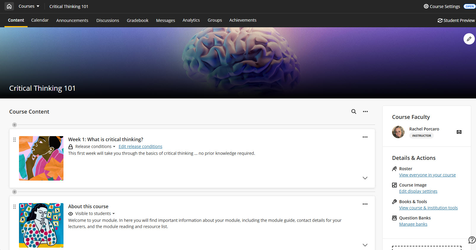
Home Button Replaces Exit
Full-Width Banner with Course Title and ID

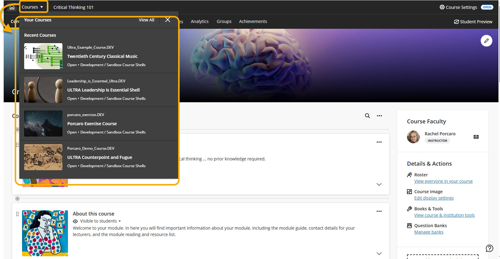
Course Switcher (In Development)
A new Course Switcher is on the way! This allows you to quickly jump between recent and other courses straight from the course, with search functionality and a direct link to the full Courses page. More enhancements are planned for future releases.