
Accessibility in Design
Why is it Important?
Accessibility in digital content, worldwide, is becoming mainstream with some companies taking the lead in designing digital experiences that further accessibility and how that is experienced by the user. In education, accessibility is becoming ever more a focus in how learning content is created and sourced. It is WSU's policy that all learning content is fully accessible by all students. But what does this mean and what does this look like?
Digital Content
Well, accessibility in digital content means that all information, be that image, video, or text, must be accessible by all users. This includes those who use screen readers, those who rely on closed captions, so forth. Because this design practice has become mainstream, most digital material we have access to online is already accessible. But, what about the digital content we create? This includes any digital text, images, graphs, so forth that we use in our classroom or through our institutional LMS, such as Blackboard?
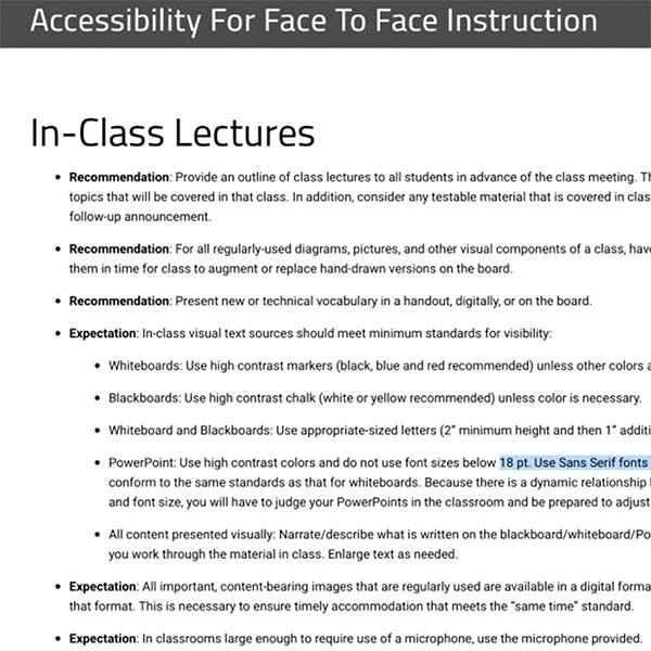
Face to Face Materials
But it's not only about digital material living in your Blackboard course. Did you know there are guidelines for font size in a PPT that is going to be projected in the classroom? Yeah, there is. And this guideline isn't to create headaches for the instructor, but to ensure that when the PPT is projected, even those sitting in the back of the lecture hall will be able to read the text on the screen.
Baked-in Accessibility
Lucky for us, most software companies are baking accessibility into their apps, and if used as intended the user can create, maintain, and check accessible content. Microsoft 365 and Adobe Creative Cloud are two examples. Both suites house some of the most used apps when creating learning assets. Not only do they have accessibility tools, but they are also available for use to WSU faculty, staff, and students.
Next Steps
You might be thinking, that's great, John. We now know we have access to software apps that can create accessible learning assets, but what exactly am I supposed know about accessibility?

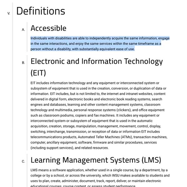
WSU's Definition of Accessible
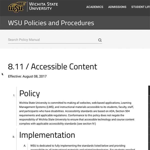
To begin, let's start with WSU's definition on what "Accessible" means when it comes to classroom content. Found within WSU's Policy Manual, and effective as of August 8th, 2017,
- Individuals with disabilities are able to independently acquire the same information, engage in the same interactions, and enjoy the same services within the same timeframe as a person without a disability, with substantially equivalent ease of use.
Accessibility Team
Since this training is centered on "design", I will only be addressing considerations when designing learning assets, not outlining the policies, or providing accessibility training.
However, I will highlight where you can find those resources along with WSU's accessibility team.
There, you should find answers to questions you might have, training you might be looking for, or the right contact for your need.
https://www.wichita.edu/services/mrc/access/index.php

Accessibility & Design
When it comes to keeping accessibility in place when designing learning content, it's useful to keep a few of the key elements & principles of design in mind. To make this a bit easier to digest, I've created a list of Do's & Don'ts to keep in mind when creating learning assets.
Do:
- Keep Good Contrast
- Remember Scale is Important
- Use Microsoft Design Styles
- Write Concise and Clear Tag & Alt-text
- Remember that White Space has a Purpose
Don't
- Rely on Color to Establish Emphasis or Information
- Use Images of Graphs or Tables
- Crowd Pages of Documents or PPT’s with Information
Summary
If I were to summarize my advice into the most condensed version possible, when it comes to designing content is "Less is more", and "Use the tools provided".
Less is more
- Spread out your information over more slides
- Keep your information design simple and clean
Use the tools provided
- Accessibility checkers
- Design Templates

Example of high contrast and low contrast

Example of using the formatting styles in text. In this example the format is for a quote.
Like to Learn More?
If you are uncertain about your first steps to making accessible content or checking to ensure your content already created is accessible, or how to make your existing content accessible if not already so, then I would encourage you to visit WSU's policies page. This page is very helpful in explaining "what is what" in plain language.
And don't forget that there is a ton of training available, including live and recorded training during our Academic Resources Conferences each Spring, Summer, and Fall.
