
Line
A line in a composition or document is anything that connects one point to another in 2D space. Lines can be actual or implied.
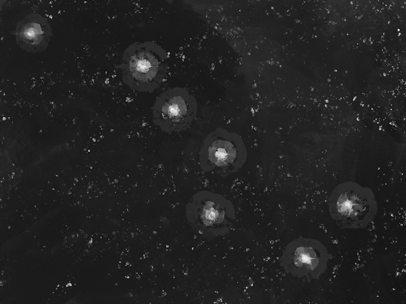
Implied lines are the creation of the human mind when points or objects align in a certain way that the brain sees a pattern or object. An example would be the way we recognize the Big Dipper from a random pattern of stars.

Example of an actual line
Example of an implied line
Lines can create:
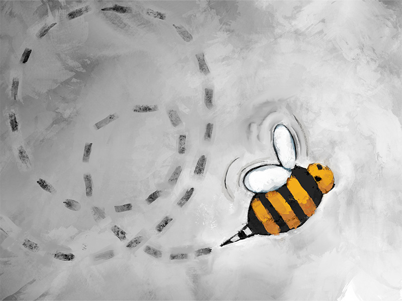
- Direction
- Momentum
- Texture
- Connection/Relationships
- Division or Sections
- Energy
Shape
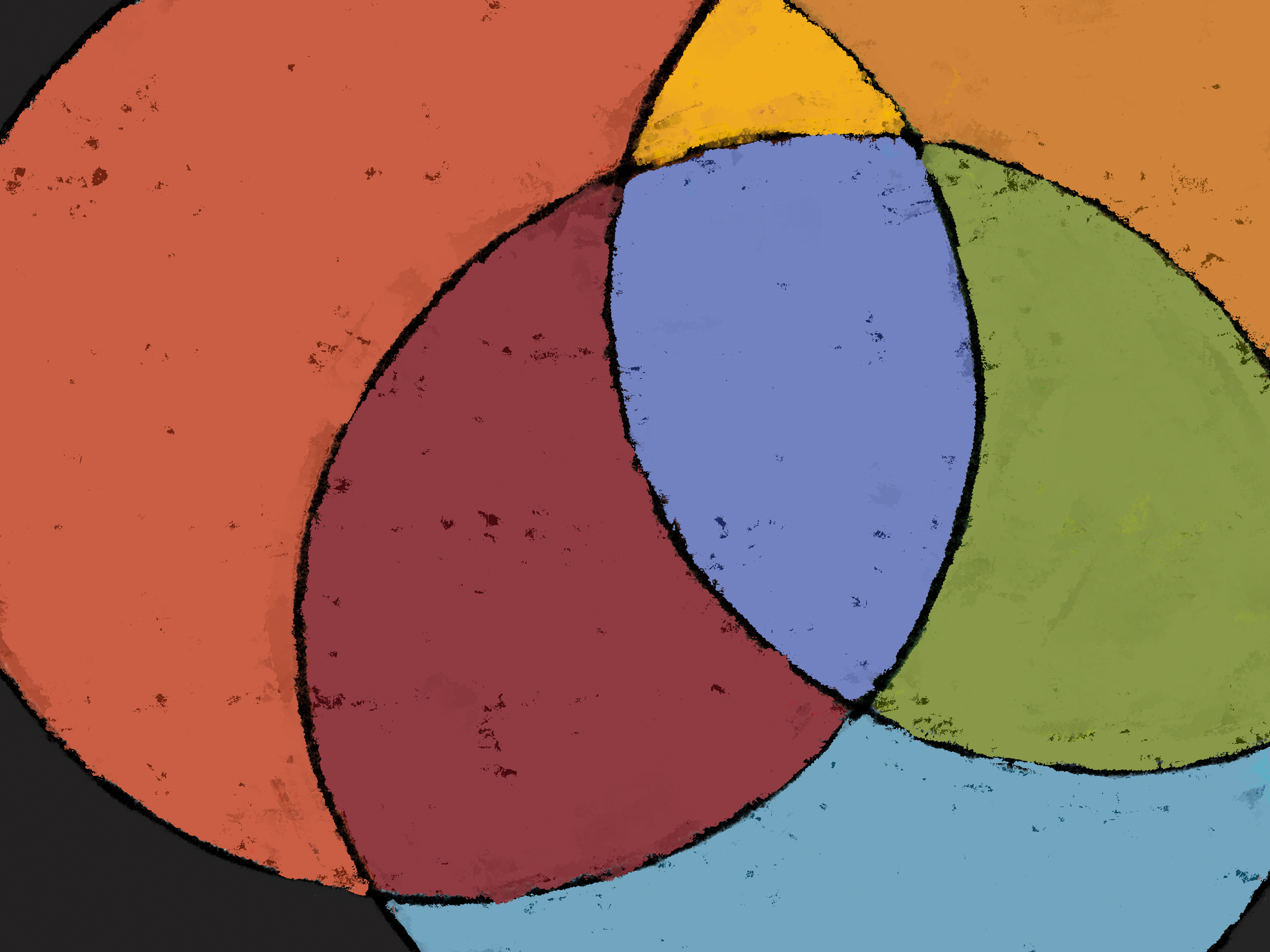
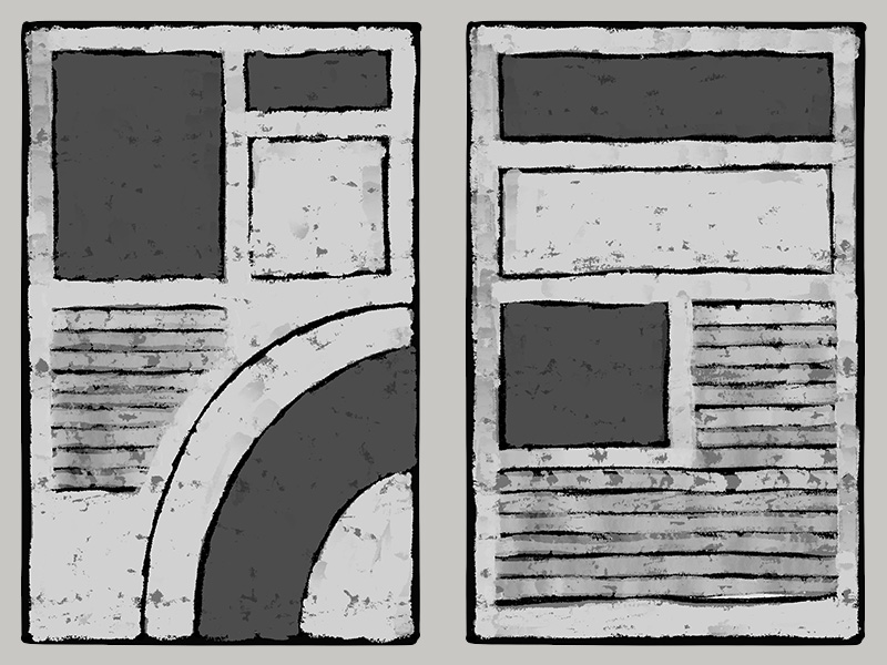
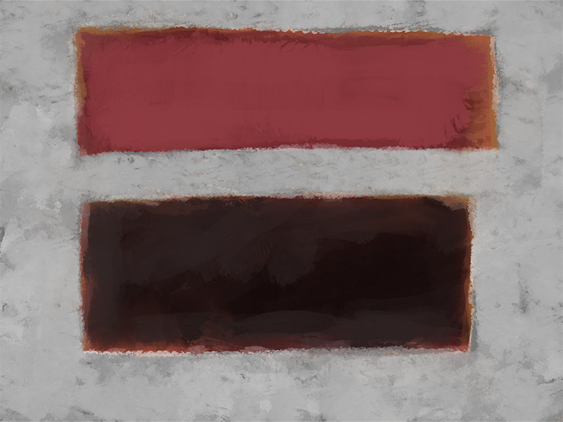
Shapes are any 2D area that has an edge. Shapes can be considered “objects” within a composition or document.
A body of text, an image, a bullet point, all of these things create visual shapes in a composition. Even the space between objects, the negative space, can seem to create a shape.
Shapes should work in a unified way with the content and support deeper understanding of the intended message.

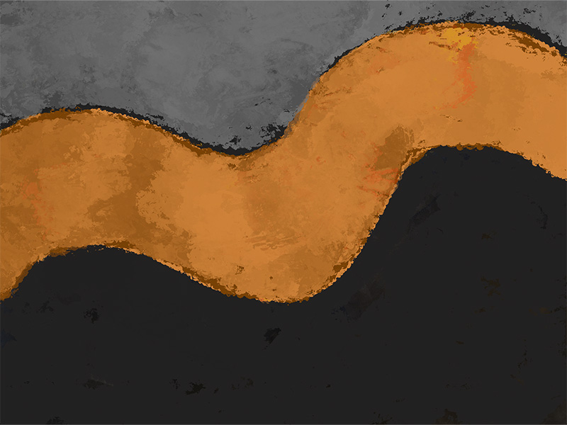
Organic Shape
Geometric Shape(s)
Types of shapes include:
- Organic
- Geometric
- Abstract
- Static
- Dynamic
Abstract Shape(s)
Static Shape(s)
Dynamic Shape
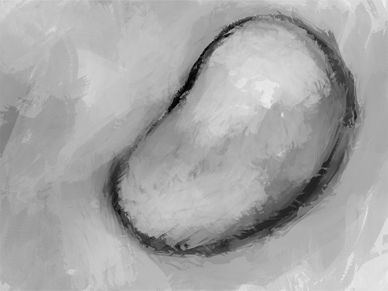
Form
Forms are the 3D extrusion of a 2D shape. An example is a square becoming a cube.
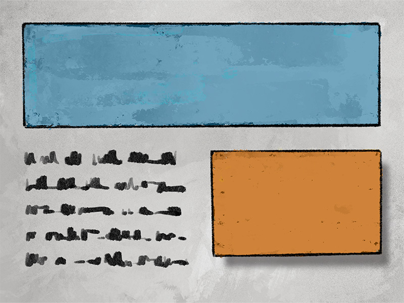
2D shapes can also be manipulated to give the illusion of having 3D attributes. Often, this is achieved by using value shifts on the shape to suggest mass and volume, and/or by using value shifts around the shape to suggest light and shadow. An example of this can be seen when using the common “drop shadow” effect found in many apps.
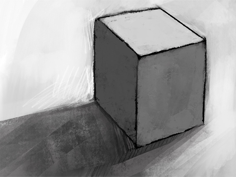

The illusion of a 3D form on a 2D surface can provide:
- Variety
- Interest
- Direction
- Hierarchy
Value
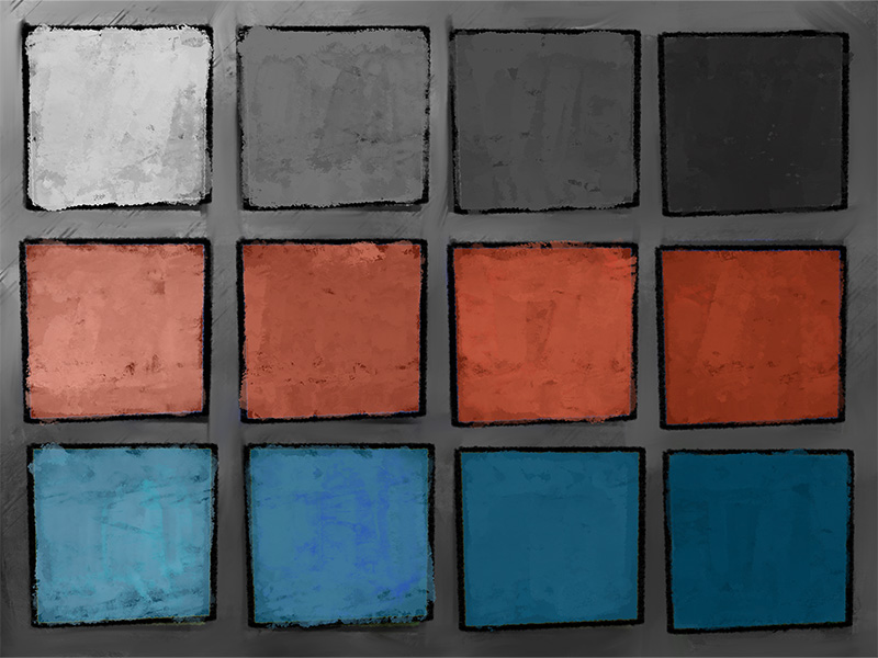
Value is the darkness or the lightness of an object in a composition or document.
Any change in the lightness or darkness of an object creates a value shift. This shift can also occur in color since any hue can be manipulated to be darker or lighter.
An example of this would be how pink is a lighter version or red or how a “stormy blue” is a darker shade of sky blue.
Value can play a key role in the saturation level of a hue, but one should not be confused with the other.


Use of value can assist in creating:
- Light & Dark Contrast
- Mass & Volume
- Contrast & Comparison
- Readability
- The Illusion of Form
Color
Color is often the most challenging of the design elements. It takes practice to use color efficiently.
It’s hard to suppress the urge to use every possible color and in any possible combination when we open up our color options, and if not managed this can quickly lead to a visual mess.
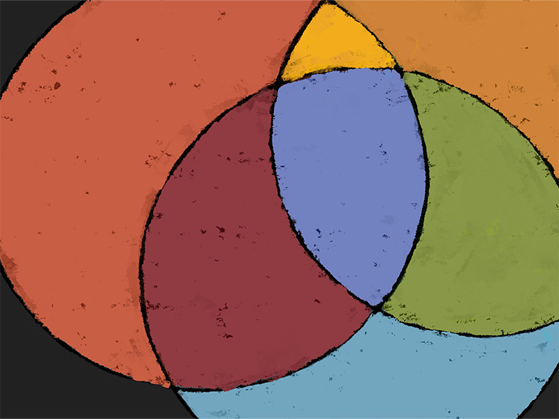
Like herbs and spices, some color combinations work well together and some not so much. Using established color harmonies can greatly improve the visual unity of the message. Using color strategically not only improves the chance of the learner connecting to the content but also understanding the intent.
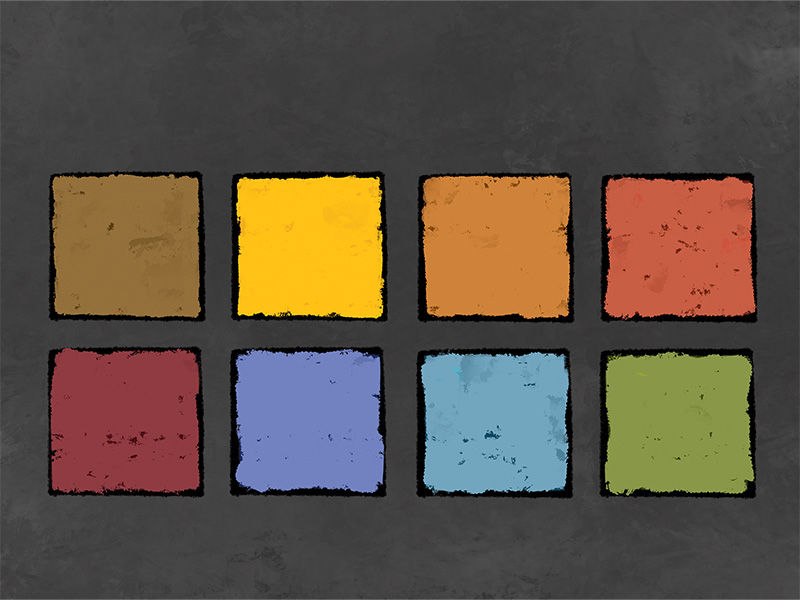


Color can be used to produce:
- Mood
- Tone
- Hierarchy
- Energy Level
- Sense of Time
- Conceptual Relationships
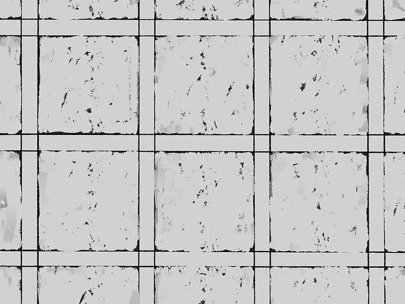
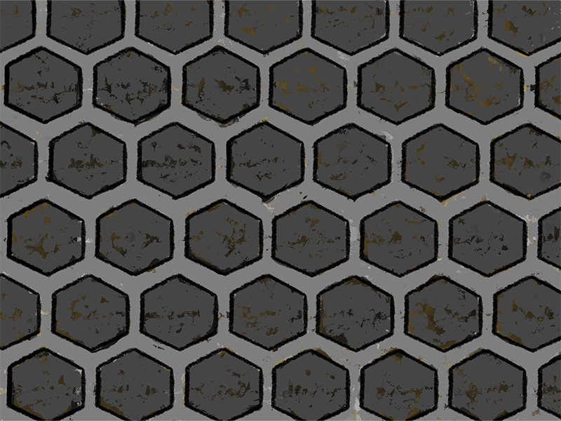
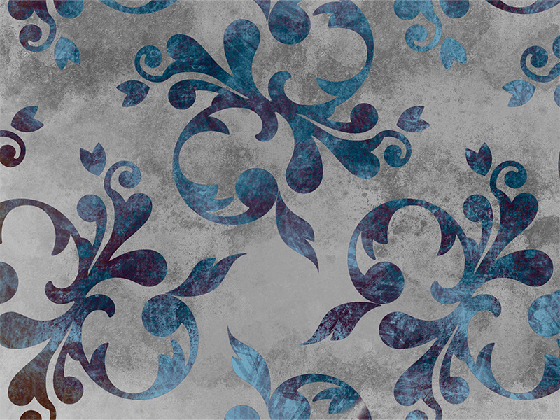
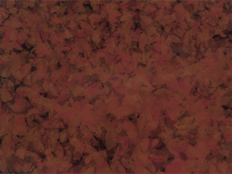
Texture
Texture can be either tactile texture or visual texture.
Tactile texture is the variation in the characteristics of a surface which you can experience from touch.
Visual texture is the appearance of a tactile surface on a 2D plan. This can be achieved by use of pattern.
An example of texture being used is how this PowerPoint is using WSU’s Wheat pattern in the background. Texture can soften a background, while still providing visual interest, or energize a background.


Texture can create:
- A Sensory Experience
- Interest
- A Visual Relief Element
- Meaning
- Relationships
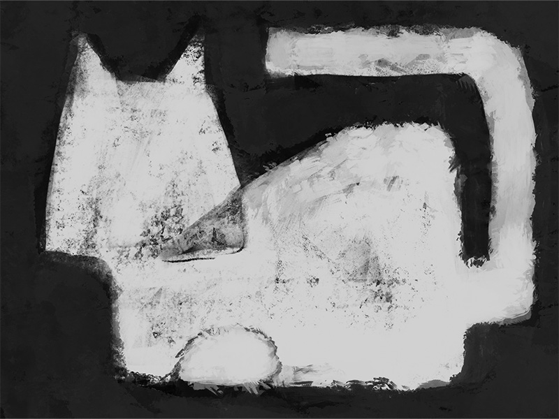
Space
Space is also known as “White Space” and “Negative Space”. Negative space doesn’t imply something unfavorable, but rather defines the space that surrounds an object. The space the object occupies is then the “positive space”.
Space is one of the most important design elements, I believe, for establishing and maintaining clear understanding of a concept within a 2D environment.


- Hierarchy
- Legibility & Readability
- Focus
- Direction
- Tempo
- Pause & Reflection
Like to Learn More?
If you wish to learn more about better design, I encourage you to visit our Additional Resource section. There you will find curated articles, scholarly journals, and training resources that can help you in your course and content design.
And be sure to attend one of our Academic Resources Conference, where we provide training and engaging conversation three times a year, every January, May, and August.
